Word Choice in Your App: Key to the User Experience
Updated: 2026-07-12
The words in an application are not filler text: they are the product’s voice. An ambiguous button label, an incomprehensible error message, or a tone that doesn’t fit the user can ruin an otherwise well-designed experience.
Key takeaways
-
Your app’s vocabulary determines whether the user understands what to do and feels confident doing it.
-
Terminological consistency throughout the application reduces cognitive load.
-
Tone must adapt to the audience: technical with developers, conversational with consumers.
-
Error messages and calls to action are the texts with the greatest impact on conversion.
-
UX writing is a distinct discipline from advertising copywriting: the goal is clarity, not persuasion.
Why words matter in UX
When a user opens an app for the first time, they don’t read the manual: they scan the interface looking for signals that they understand what to do. Nielsen Norman Group, the reference consultancy in UX research, sums this up in its UX writing study guide[1]: on-screen reading behaviour is mostly scanning, not sustained reading, so the first words of each label carry the most weight. Every label, tooltip, confirmation message, and error text is a signal. If those signals are confusing, the user hesitates; if they are contradictory, the user makes mistakes; if they are clear, the user flows.
Three critical moments where words make or break the experience:
-
Onboarding: the first contact sets expectations. Welcoming, direct language reduces abandonment in the first minutes.
-
Error states: "Something went wrong" doesn’t help anyone. "We couldn’t connect to the server. Check your connection and try again" does.
-
Calls to action (CTA): "Submit" is generic; "Create my free account" is specific, benefit-oriented, and reduces friction.
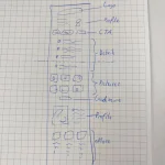
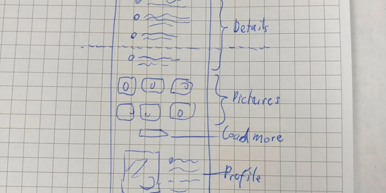
 Mobile interface sketch showing the distribution of text, buttons, and navigation in an application
Principles for choosing effective words
Clarity first. The goal of interface text is not to impress the user but to help them complete their task. Every word that doesn’t help, hinders. Google’s Material Design content design guidelines[2] formalise the same idea: interface text should be short, scannable and direct, using the fewest words that communicate the idea without losing clarity.
Four operational principles:
-
Use your user’s vocabulary, not your technical team’s. "Sync" may make sense internally; "Update" is what the user understands.
-
Be specific in action verbs. "Save draft", "Publish now", and "Schedule publication" are three different actions that "Save" doesn’t distinguish.
-
Maintain terminological consistency. If one screen calls something a "project" and another a "workspace", the user doesn’t know if they’re the same thing.
-
Calibrate tone to context. Duolingo uses humour and encouragement in a language learning app; a banking app uses precision and seriousness. Neither is wrong; each is appropriate for its audience.
Best practices with real examples
Duolingo is the most cited UX writing case study. Its texts are:
-
Conversational and friendly ("You’re on a streak! Don’t break your 7-day run").
-
Progress-oriented, not failure-oriented ("Complete this lesson to earn XP").
-
Consistent across all platforms (iOS, Android, web, email, push notifications).
Uber exemplifies transactional clarity:
-
Each trip state has precise text: "Finding driver", "Driver on the way", "Arriving in 3 min".
-
Payment error messages are actionable: "Your card was declined. Add another payment method."
-
Terminology is identical in the app, in the confirmation email, and on the receipt.
This consistency is possible because text is treated as part of the design, not as a later step: Uber’s Base design system explicitly documents its writing guidelines[3], with a direct, informal style and consistent vocabulary across the 50-plus languages its product is localised into.
Common mistakes to avoid
-
Technical jargon without translation: "Invalid authentication token" versus "Your session expired. Sign in again."
-
Generic text in errors: "Unknown error" is an admission of defeat, not a solution.
-
Inconsistency in synonyms: "Delete", "Remove", "Clear", and "Disable" are not interchangeable: each implies a different action with different consequences.
-
Mismatched tone: a tax assistant that jokes at the moment of confirming a payment generates distrust.
-
Literal translation without localisation: adapting text to each language means translating cultural context, not just words.
WCAG web accessibility also affects language: W3C success criterion 3.1.1[4] requires the content language to be programmatically identifiable, and related criteria require text to be readable and understandable. Good UX writing that uses plain language improves the experience and, in turn, accessibility compliance.
Conclusion
Word choice in an application is a design decision, not a writing task. The best interface text is the one users don’t notice because it simply helps them do what they want to do. Investing in UX writing from the earliest stages of the product is cheaper than fixing it after users have already learned to tolerate the confusion.
Read the Spanish version too: La elección de palabras en tu app: clave para la experiencia del usuario.


